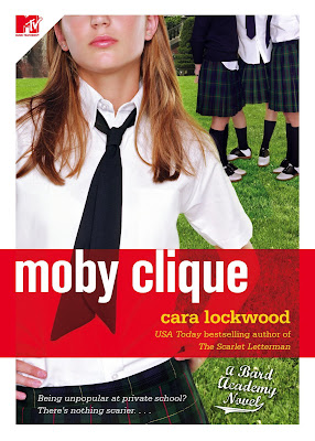
 Moby Clique by Cara Lockwood
 Mean Girls by Hayley DiMarco
Eh. I don't love either of these, they both have A LOT going on. I guess if I had to choose Moby Clique.
Which do you prefer?
Thanks to
Yan and
Kelsey for pointing out this lookalike!
Have you spotted a Lookalike you would like to contribute? Send me an email!
Oh this is no contest (for me), def the bottom. I love the color scheme with black/yellow and the like, it just looks... good (most of the time), so second one for me!
ReplyDeleteI dont like both of them. But if I had to choose I would pick the bottom one!
ReplyDeleteCheck out her hair. It's the exACT same girl. They just pinked up the lips at the top or maybe the bottom one stole it...either way, kind of mean to steal the other's girl.
ReplyDeleteI probably like the bottom one better. The cover's aren't great, but they do fit the books.
ReplyDeleteHmmm. I like Moby Clique better. The background with the girls is cool.
ReplyDeleteI like the first one - but I'm not thrilled with either!
ReplyDeleteI object to Moby Clique because I've had it with chopping women's (or girls') faces off on book covers.
ReplyDeleteThat said, I don't think the cover design for Mean Girls is anything much. To design something simultaneously busy and blah is quite a trick.