Breathless (Orca Soundings) by Pam Withers

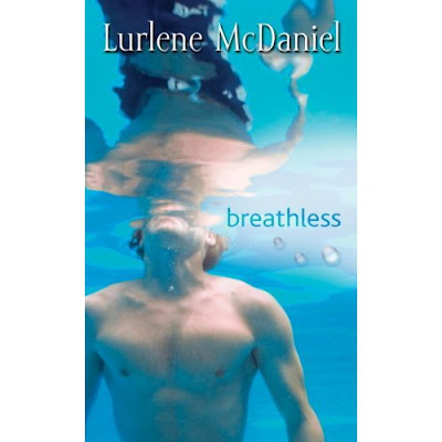
Breathless by Lurlene McDaniel
I like this set of lookalikes because the books have the same title and very similar styles of photography. Same blue and everything! I like the photography of the first cover and the title treatment better on the second.
Which is your favorite?

That color of blue is just so calming.
ReplyDeleteThe picture is nice on the first one, but the wording makes it look very amateur. Number 2 is much nicer.
ReplyDeleteI like the reflection of the man on the second one. That's strange about the title and cover being the same! Makes me wonder how similar the actual stories are
ReplyDeleteHow weird is that - the same name and similar covers. I'm not sure which one I like better, but the title is definitely better on the second one.
ReplyDeleteI agree with your statement Alea. However if I had to choose I'd go with the second cover.
ReplyDeleteI like the second one better all round.
ReplyDeleteHmm, both are a nice attractive color of blue. I agree with you in liking the title treatment of the second more, but I like the lighting of the first, and there's the naked torso of a guy on the second, which is just... uh... weird, in my opinion. :D
ReplyDeleteI like the reflection in the second cover. I can't swim so I have to disagree with anyone who finds these covers to be calming. I feel like screaming for help. Anyhoo back to the covers I like the second one.
ReplyDeleteI couldn't pick honestly. Both are so beautiful.
ReplyDeleteThe top one is my fave because the other one makes me feel like a can't breath. So maybe the bottom one should be my fave because it elicits such a response. Great covers.. :)
ReplyDeleteWow. Same title as well. I bet that's confused people before!
ReplyDeleteI like Lurlene's because he's coming up for air, and if you are truly breathless, isn't that what you'd do? Stupid reason, but oh well.
ReplyDeleteAnd same name, too....confusing! LOL (:
ReplyDeleteI like the second better.
ReplyDeletehttp://thebookworm07.blogspot.com/
Very interesting. I like the first one as well.
ReplyDeleteI don't really like either one but I'd have to go with the first one.
ReplyDeleteSo funny they have the same title and everything. I like the second one better. It's got a better composition and better lettering.
ReplyDeleteUmmmm...the second one. :)
ReplyDeleteNow this was a funny one, I was looking up Lurlene McDaniel's book to try and find the plot on Amazon (i don't think it was up) and basically Amazon provided this lookalike in the search results!
ReplyDeleteThanks for weighing in everyone!
I just read "Would you?" by Marthe Jocelyn and remembered this post, as the cover is also similar http://www.amazon.ca/Would-You-Marthe-Jocelyn/dp/0887768164/ref=sr_1_1?ie=UTF8&s=books&qid=1267328489&sr=8-1
ReplyDelete