 The Sky Isn't Visible from Here by Felicia C. Sullivan
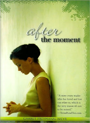
I really like how the title has been constructed on The Sky Isn't Visible here, something about strong typography mixed with a photo really gets me going. And the monochromatic color scheme is also really nice. After the Moment is fine but I'm not really fond of how the color scheme was pushed into that sort of over saturated yellow and the grungy border.
Have you spotted a Lookalike you would like to contribute? Send me an email!


I do think the title treatment is better in The Sky Isn't Visible From Here but I like that you can see more of the girl in After the Moment, so it's a tie for me.
ReplyDeleteI agree with bermudaonion. I'm not a fan of the half-girl.
ReplyDeleteI like After the Moment better too.
ReplyDeleteI like the first one much better. The placement of the title pulls you in.
ReplyDeleteThe After the Moment book is much better. I really don't like the font and the color on the other one.
ReplyDeleteI find The Sky...'s type treatment too crowded and the image too muddy. I'm not a fan of the weird edge treatment on After..., but I prefer its brighter, more open design.
ReplyDeleteI'm also opposed to the half-girl.